
(Developed in close collaboration with Jay Hallstein, our factory liaison.)
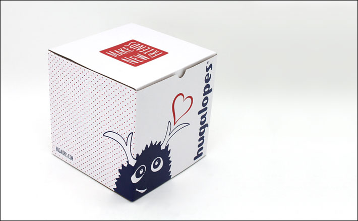
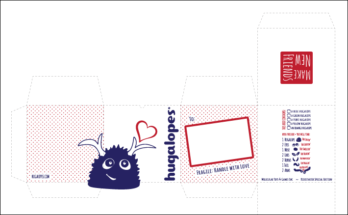
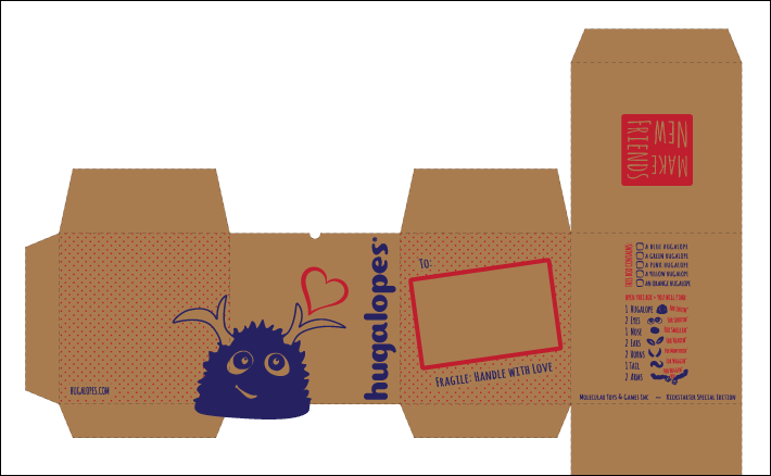
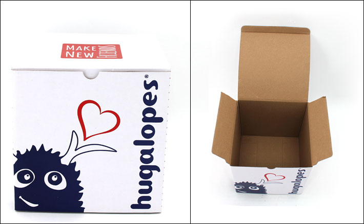
The box is an 8″ cube and suitable for shipping. Emphasis has been given to a clean yet whimsical and friendly design by way of the basic two color scheme, hand printed font and ample use of negative space. Great care went into making each side of the box meaningful and attractive.
- The wrap around character and name logo comprise the front of the box. The logo is based on the Ponytail font with subtle but important modifications such as a smiling ‘e’.
- Eschewing corporate sterility, the package contents on the back are listed in the Amatic font and accompanied by simple, childlike illustrations.
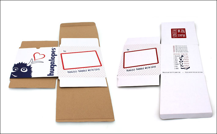
- The red dot pattern sets one side apart from the others. This side has a space reserved for a standard USPS shipping label, with instructions to handle the package with love.
- The top of the box offers up a friendly message – Make New Friends, a pun on the construction system aspect of the Hugalopes.
- While the warmth and charm of the brand can be seen in even the earliest version of the package, subsequent versions moved toward a cleaner, minimal design.
- Some of the adjustments are quite subtle – the Hugalope illustration gains a smile and the eyes look up at the heart in the final version.
The refined polish of the package signals a high quality product inside and promises a specialty toy that has been designed and created with great love and attention to detail.
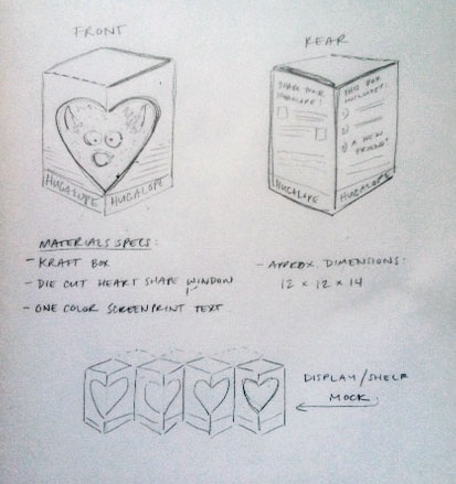
This sketch is Jay’s lovely concept for a die cut heart shaped window through which the Hugalope would be visible.The current design allows the box to be sent through the post without any additional packaging but we adore this idea for retail display and hope it comes to fruition one day.